Click To Enlarge
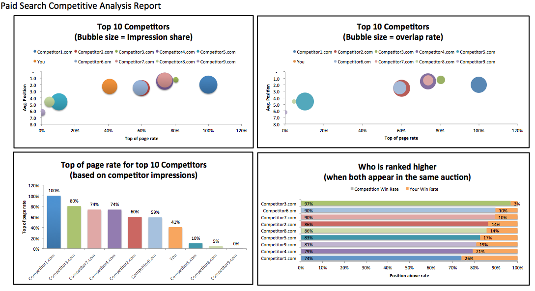
Ideally the first bubble chart gives you insight into where you sit in relation to your competitor’s impression share, avg. position and top of page rate. How competitive are you with these other advertisers? If you’re similar size and position expect high costs and aggressive bidding.
The second bubble chart shows the relation of avg. position and top of page rate with the competitors you overlap with the most. The more bubbles of similar size, the more competitive the auction is.
The Top Of Page Rate column chart gives you an idea of how aggressive you are relative to the competition for that data you’re analyzing. Are the competitors that are ranking higher than you also winning out the most when you are in the same auction?
I copied over the colors from the bubble charts to the bar charts so that you can follow one competitor across all comparisons. This way it’s easy to see if a competitor with high overlap rate ranks higher than you when in the same auction.
Is ranking higher than one of your competitors important to you? With the Who Is Ranked Higher chart you can see how often that is happening and with the other column chart you can see how competitive they are overall.
Download the Paid Search Competitive Analysis Template (.xlsx)