3 Great Uses of Advanced Filters in Google Analytics

While going through different reprots in Google Analytics, analyzing what is and isnt working can be difficult if you have thousands of keywords, referring sites and pages in your reports cluttering everything up. You want to be able to efficiently look through them to find something useful. To do this use the Advanced Filter under that report table.

Here a few uses I have found work great…

1. Top Landing Pages sorted by bounce rate

Content > Top Landing Pages

When you pull this report and sort by bounce rate you get a bunch of pages that only have one entrance that keep you from seeing the landing pages that matter. Create a filter with Entrances Greater than 100 or whatever number suits your site. Now the good and the bad are revealed and you can pick which pages need the most immediate help. Go to this post on analyzing top landing pages for the next step to finding insights.

2. Non-Paid Keywords sorted by conversion rate

Traffic Sources > Keywords. Show: non-paid. Ecommerce Tab

When looking at Non-paid keywords, create a filter for keywords with a conversion rate of better than 10%. There is something about these keywords that align perfectly with your site. You might consider including these words in your PPC campaigns or look at including them in meta tags, include them more often in the content of applicable pages or create altogether new pages that focus on these keywrods, all of which will help SEO.

3. Referring Sites sorted by per visit value

Traffic Sources > Referring Sites. Ecommerce Tab

Similar to sorting keywords, when you’re looking at referring sites you want to analyze only the ones that have any significance instead of all those random ones that have only one visit, so filter visits by a number that’s higher than the average and voilà, you can now see just those referring sites that convert the best. (To be able to see the full referring URL in the user defined report go here.)
An Easy Example Of How To Use Google Analytics To Improve Your Site

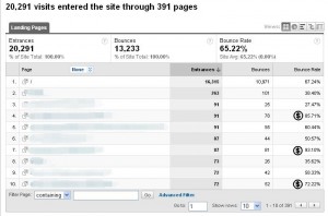
This is one of the first things I look at when I analyze any website. Under Content in the left column click on Top Landing Pages. These are the most frequently landed on pages that your visitors see when they first come to your website. These are your “head” pages, which means that small improvements to these pages can quickly yield high ROI. In the furthest right column in the report is the bounce rate for each of these pages. % Bounce Rate means the % of visitors that came to your site and then left instantly, or in other words, that landing page was not compelling enough for them to read more than that one page. Bounce rate is a great metric to measure the quality of the traffic you are acquiring. It helps you hone in on where and how your website is failing your visitors.

So now you can see what is failing, in one more step you can get an idea of why it is failing: Click on one of those poor performing pages (I put little cash signs next to my contenders) with a high bounce rate to analyze it on it’s own. Then click on the drop down that says Content Detail on it and select Entrance Keywords. Do the keywords people use to get to this page align with the content of the page? Looking at their keywords you can get a sense of what their intent was and why it doesn’t match up with what the page is delivering. Now you have something to work with and fix. Now make the changes to that page so that it better matches what your visitors want. Bounce rate will go down, and positive outcomes will increase.

Simple PPC Bid Strategy Using Impression Share Report

When setting out to manage and optimize bids in paid search, looking at all the campaigns, adgroups and keywords at once can be overwhelming. I like using the impression share report as a starting point for focusing optimization strategies and managing bids.

In AdWords make the following report: 1. Report Type: Click Campaign Performance. 2. Settings: Set Weekly visits, set the date range for a few months and select all campaigns. 3. Advanced Settigns: Add the following Columns: Impression Share, Lost IS (Rank), Lost IS (Budget), Conversions, Conv. Rate, Cost/Conv.
That’s it – once the report is made export it into Excel. In Excel sort by Campaign so that you can see the increase or decrease in impression share week to week for each campaign. Now we can cover the what, why and how.

What:
Start off by looking for campaigns with low impression share and then look across at the Cost/Conv column. If Cost/Conv is within your accepted range for these low impression share campaigns, then you are leaving money on the table by not maximizing your impression share. Likewise, if impression share is high for certain campaigns and their Cost/Conv is high, you might consider decreasing impression share.

Why:
With these initial insights look at the Lost IS (rank) column and Lost IS (budget) column. These two columns will tell you why you have low impression share. If Lost IS (budget) is high, this means your ads are not showing as often as they could because your campaign budget is being tapped. If your Lost IS (rank) is high, this means your keyword bids are so low to the point that your ads aren’t appearing.

How:
The campaigns with low Cost/Conv and high Conv. Rate are you hero campaigns. These should have as much impression share as possible. Give them unlimited budget (why limit it? As long as the ROI is worth it you should push these campaigns as far as they’ll go) and give their keywords higher bids. Google has a bid simulator built in for giving you an idea of how much traffic will result in your bid, but don’t worry too much about it, set a bid that seems right and then test how it performs. You can adjust it once you see the results.
The campaigns that are in-between need a little more time and effort. This is where you’ll dive into individual adgroups and keywords to discover which ones are causing the bad Cost/Conv and low Conversion Rate. Decrease bids on the losers and increase bids on the winners. Click through your ads to see if the keywords you are bidding on match the landing pages you are giving your visitor. Try different keyword match types.

This PPC bid optimization strategy allows you to prioritize your efforts so that you increase the biggest winners and get rid of the biggest losers first. Once done, go back the next week and see your results. I like to make my changes all in one day and then leave it alone for a week instead of making little changes day to day which makes it harder to recognize causation.

Consultants Are Overrated, You Need An Analyst


I think this screen shot from insights for search tells the story all by itself. The age of hiring a “consultant” are coming to an end. Why would you hire someone with all this so-called experience when your own business, with it’s specific problems and issues, has all the data it needs to figure out what to do? What you really need is a skilled analyst to figure out what all that data is saying.

In a post by Stephen Few,

The problems that we face today, both big ones in society like the current health care debate and smaller ones like strategic business decisions, do not exist because we lack information, but because we don’t understand it. They can be solved only by developing skills and tools to make sense of information that is often complex. In other words, the major obstacle to solving modern problems isn’t the lack of information, solved by acquiring it, but the lack of understanding, solved by analytics.

Web Analytics Planning Dashboard In Excel

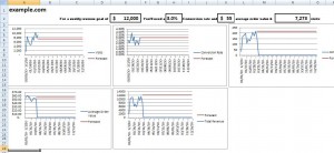
Sometimes while looking at all your web analytics data it’s difficult to figure out where to focus. This dashboard allows you to take a very maco look at where your site is at, define where you want to be in terms of revenue and then set some high up goals.

This dashboard uses the following metrics: visits, conversions, conversion rate, average order value and total revenue. With some simple formulas you can see what effect a percent increase in conversion rate or average order value will have on revenue in a visual way.

So if you set your revenue goal first you can mess with the other metrics and then focus on which other metrics you want to divide and conquer. So let’s say you decide that if you could get 1,000 more visits while maintaining the same conversion rate you can reach your revenue goal. Then you can make your tactical plan to get those 1,000 more visits like working at SEO, expand your PPC keyword coverage or push your affiliates. If you see that a $3 increase in average order value will get you there, then maybe you’ll start merchandising your site differently or include more up sells – you get the idea.

Download: Web Analytics Planning Dashboard In Excel

Managing the Long Tail of Search

Long Tail keywords individually might not make the biggest difference to your overall PPC account. But in aggregate these long tail keywords can sometimes mean huge amounts of traffic and lots of money. Setting up you PPC account with your most popular, or “head”, keywords set to broad match is not an effective strategy to capture all of your long tail traffic and have a positive PPC campaign. Here’s why:

1. You will hurt you click through rate due to less targeted ad copy. look at these two examples for the query “Gibson Acoustic Guitar”.

Where one is only bidding on the broad match of Gibson Guitar, the other is bidding on the longer phrase Gibson Acoustic Guitar. Not only is the former ad more targeted and therfore more likely to get my click, its quality score will be better due to keywords in the ad text which will save money and give it a higher ad position.

2. Conversion rate will improve. Take a look at the landing pages for both of the previous ads.

One is showing me exactly what I was looking for, Acoustic Guitars, and the other shows me both electric and acoustic which means it is not inline with my intent so I will most likely bounce.
3. Better bid management. Let’s say that you have your adwords accounts set up so that each one of these long tail products are organized by category and theme. This way if there is a seasonality element or if something goes on sale you can easily increase your bids for just that product segment and keep all the rest of your campaigns running at the same cost. This means you can be more nimble and cost effective with your inventory.

So that’s the why long tail keyword management is better than just using broad match head terms, here’s the how:

1. First start by running a Search Query Report in AdWords and find all the keywords that are trigging your ads that you arn’t currently bidding on that make sense. Orgainze these keywords into themes that you can build campaigns around. In this example’s case, one campain set up for general acoustic guitars, another around Gibson guitars and another around Gibson acoustic guitars.

2. Expand on that list with this long tail key word tool to figure out all the permutations of those keywords.

3. Also use modular ad text. Meaning don’t make the second line flow over into the third line on the adtext, make them seperate sentences. This will help you mix and match adtext on the fly so that if acoustic guitars go on sale you can easily swap out one of the lines and replace it with something like, “Now 20% Off, Buy Now!”

Monitoring these keywords takes more time and more effort to set up, but in the long run means a much more effective PPC marketing effort.

How Brands Can Start The Conversation In Social Media

“Join the conversation” is a big buzzword these days for telling brands they need to start using social media. The idea is that there are already a lot of people out there talking about you so you’d better start being a part of what they are saying so you can overcome concerns or right wrongs and inaccuracies. To do this you set up alerts in Google and search for your brand name on Twitter and then jump in when you can. I think that just as much effort should be put into starting the conversation as joining it.
Here are my three ideas for the kinds of conversations that brands or companies can have with their fans:
1. Conversation centered on your product or service.
  • Enhance memory with fun product centered quizzes and facts
  • Add to credibility with customer testimonials or industry wards.
  • Reveal hidden attributes by asking the customer how they use the product and then share that with the community.
  • Hold your customer’s attention with stories of your product in action written by those who use it day to day.
  • Influence preferences by making the product more interactive and vivid.

2. Conversation centered on what the interests of your customers.

  • To do this, brainstorm 3 main interests that your customers are into that doesn’t have to do with your product. Maybe its gardening, traveling and raising kids. Put yourself in the head of your customers and find interesting content done by gardening blogs, talk about it and link to it. Invite your fans to submit their summer vacation plans. Write tips on best ways to keep kids safe at playgrounds. Remember, you’re not trying to write about these things and then secretly inject your brand name in the background somewhere or mention how your product is great when you’re gardening, traveling and raising kids. You’re just starting a conversation with your like-minded fans on subjects you are mutually interested in.
3. Conversation centered on the customer.
  • One on one dialogs with customers about their questions and needs, open up their questions for the community to answer and discuss.
  • Make customers famous by featuring their posts about your product and highlight their images submitted to you.
  • Shout-outs and props given to fans who do something cool or note-worthy.

Any more ideas on conversation starters for brands? Leave em’ in the comments.

How To Quantify Success in SEO

SEO is a means to an end, not the end itself. You want your site to rank higher so you get get more traffic, but what use is more traffic if it’s unqualified traffic? Traffic that just bounces and whose intent doesn’t match your website’s purpose? I believe that the biggest mistake in SEO is that we are far too obsessed with ranking instead of focusing more on what the business impact of our SEO efforts are.
Here are a few tips in Google Analytics to see if SEO is paying off:

1. Log into Google Analytics and click on the Advanced Segments box in the right hand corner. Create a new segment for Organic traffic.
Then go to Content > Top Content and apply the Advanced Segment. Stretch the timeline back to when you first started your SEO efforts. Do you see your segment line going up and to the right? Then something is working. You’ll want to see if organic traffic is improving on the pages of your site that you are optimizing. You can drill down to these pages in this report and see how your organic segment looks.

2.When looking at a specific page’s traffic, next to Analyze:, pick Entrance Keywords from the drop down. Do the keywords match the intent of the page? Do they contain keywords you were specifically using to optimize the page? No? Why not? On the other hand what are the surprises? Is there customer intent contained in the keywords telling you how to change or improve the page? Re-evaluate your list of most important keywords for this page with this report.

3.Change the view to the Comparison View and then change the dropdown to Bounce Rate. This will compare these keyword’s bounce rate to your site’s average. If you are pushing keywords that have a bounce rate in the red you might consider choosing different keywords for this page since they aren’t a good match with the customer’s intent.

4. Go to the Ecommerce report and apply your organic segment, stretch the time period, and report how well your SEO efforts are delivering value to the business.

Example PPC Dashboard in Excel

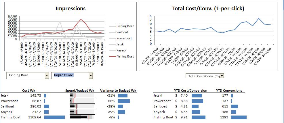
If you’re working in an environment where you have to do weekly reporting on your AdWords performance, and the reports in AdWords aren’t cutting it, you may want to invest some time into making your own PPC dashboard in Excel. Plus I think putting the data together in this way leads to insights that aren’t as easy to notice in the AdWords interface. This is an example of a dashboard for a mock small rental company with only 5 campaigns in their account. If your account is bigger and than this and runs campaigns in the double digits you may want to consider a different layout.

PPC Dashboard for Excel

Click For A Larger Image

The “spend/budget wk” in-cell graph was made using Sparklines and a tutorial on how to make the interactive line charts can be found here. (You can download the Excel file below and play around with it too.)

I’m going to walk you through how to use this dashboard and hopefully discover some insights along the way:

Going counter-clockwise through the report allows you to dig deeper into what is going on and hopefully make some actionable insights.
Starting with the graph in the upper right, you can switch between any of the metrics at a higher up account total level. Lets say you’re looking at the cost/conversion view and notice that cost/conversion has been around $8 for a while and then in the last few weeks it has risen to $9 and above. Let’s see if we can figure out the reason.
Moving to the next graph to the left, you can set the first drop down to highlight a particular campaign and then in the next drop down you can choose which metric you want to focus on, in this case I want to look at Avg. CPC to see if any campaign is going up in cost making the cost/conversion go up. Flipping through the different campaigns I can see that they are all pretty even except that the Fishing Boat campaign jumped up in Avg. CPC over the last few weeks.What happened?

Leaving the first dropdown highlighting the Fishing Boat, I can now switch between the different metrics associated with the Fishing Boat in the next drop down. It looks like impressions have been going up, possibly to seasonal demand, and clicks have been going up right along with it together showing CTR maintaining at that same 3% range. But when impressions and clicks went down again, presumably after demand has fell off in July, you can see cost/conversion start to jump higher and higher.


Is it possible that bids were increased to keep up with demand but as soon as demand fell off, those bids weren’t decreased at the right time to adjust for that change in demand? Insight – try lowering your bids!
You can also see conversion rate drop a percentage point from the beginning of July to the end of July for the Fishing Boat campaign. Is it possible that many of the keywords that convert well during the peak of impressions at the start of July don’t work as well towards the end? Look in AdWords for bad performing keywords.
Have you noticed that the Sail Boat campaign has the 2nd lowest Avg. CPC, highest conversion rate and the second highest amount of conversions? This campaign is kicking butt! Is there more you could do to maximize it, ad more keywords, up bids, etc.? Take a look at it’s landing pages, what is it doing that the others aren’t?
Below the graph on the left is a Cost and Budget chart. As long as your cost/conversion is at an acceptable amount you want to make sure you arn’t hitting your daily budget. In this screen shot you can see that the Fishing Boat is getting close so you may want to increase it’s budget.


In the next chart over you can see the total conversions and total cost/conversion. Although the Fishing Boat campaign has the highest amount of conversions it also has the highest cost/conversion. The powerboat account has the lowest amount of conversions and the highest cost/conversion. It might be a good idea to go back to the upper left data graph and look at the different metrics around Powerboat to see if anything can be improved.
Here’s the Excel file for the PPC Dashboard, feel free to download and play around with it yourself and let me know what you think!

Social Media Flow Chart: Blog vs. Facebook vs. Twitter

This flowchart is from my Social Media Strategy eBook. Getting your blog, Facebook and Twitter to work together is a challenge. I think deciding where an idea should go (and just as important, where it shouldn’t go) can be difficult. That’s why I put together this flow chart for deciding on whether your your idea should be blogged, Facebooked or Tweeted. You’ll notice the arrows going from the blog to Facebook to twitter; these mean that what gets posted on your blog can be posted on Facebook which in turn can also be tweeted. Doing the reverse is a bad idea (ever been annoyed by a ton of someone’s tweets in your Facebook news feed?). I’d love to hear your feedback if you have any…

Click for larger image